

Essays for ‘Fluid Structures’
Amber Wilson: A temporary outsideness
By Lucinda Bennett
When I visit her studio, Amber Wilson gestures towards the couch, a low-slung creature with scratchy brown ’70s upholstery. She describes the way the sunlight streaming into the room moves across its surface throughout the day, creating irregularities, disrupting the woven grid. Similar disruptions can be found in more enduring forms throughout visual history, such as when they are spun into the very fabric of carpets and tapestries. They materialise by happy accident when the dye changes colour, or when a new weaver takes over with a slightly tighter stitch. These same coincidental shimmers, which disturb the seamlessness of our perceptions of sunlight and textiles, are present in Wilson’s watercolours.
Bewitching in their delicacy, the shimmers become apparent only during intimate viewings of the paintings, when your gaze stumbles slightly on a line that slips or curves the wrong way. They unfold when a rhythm is broken, causing your eye, your body, or the world to wobble, just for a moment. Like an earthquake that transpires so swiftly you can’t be sure it happened at all, just for a moment your physical position in the world is called into question. You experience a temporary outsideness from your body, which might feel numb, might tingle pleasurably, might feel something like the heady swoop of vertigo on a soupy summer day.
Sensation, as philosopher Brian Massumi tells us, is never simple: it is always doubled by the feeling of having a feeling. In the very moment in which we are perceiving a visual form, so too are we thinking of that perception. Furthermore, we are not only thinking of it as we are feeling it, but also through our feeling of it. The cubists recognised this inherently, composing works to arouse and indulge in the voluptuous experiencing of an object. Through showing the front, behind and around of a thing all at once, they communicated heft, the dynamics of line and temporality, privileging our bodily awareness of a thing above binocular visual accuracy.
In her watercolours, Wilson achieves something similar without dissecting specific objects, although you could be forgiven for intuiting particular objects cloaked within her abstract forms. Though brimming with references to the material world – to textiles, to the modernist sculptures of Barbara Hepworth and Henry Moore, to the reworked terrazzo pattern made famous by the Memphis design group of Milan – recognition of these sources is inessential to an understanding of these paintings. Indeed, volume, the very anchor of the material world, is absent in them: monumental blocks of pastel patterning and swathes of thickly woven fabric-forms float alongside one another in blank white space, never colliding, never touching the border. Quite unlike the most famed works of cubism, in which complex geometrical forms rise like vast crystal cities to fill the canvas, Wilson’s forms are weightless and calm.
Back in her studio, Wilson explains how her paintings often take shape through curiosity and unknowing. Marks are made, shapes and compositions are formed organically through and around them. Looking at them, it seems strange that tranquillity is a quality we generally love to associate with watercolour, given how singularly volatile a medium it is. One slip of the wrist can nullify a thousand careful marks. Any feeling of calm we may experience before Wilson’s paintings belies the audacity of their making, but their daring is imperfectly masked. Each volitional slip and blemish is like a little wink or nudge, pushing us outside of easy tranquillity, hinting at chaos. With each careful quaver, the mask slips for a moment and we move outside of ourselves – just for a moment.
Georgie Hill: Detailing the route between order and chaos
By Linda Tyler
In his short story ‘Funes, the Memorious’, Jorge Luis Borges describes the dizzying world of Ireneo Funes, who – rendered hypersensitive to details by an accident that has left him blind – is now incapable of thinking in the abstract, or generalising: ‘In the overly replete world of Funes, there was nothing but details, almost contiguous details.’ This is a cautionary tale for the devotee of Georgie Hill’s work. It is possible to become lost in the minutiae – the incisions, the punch holes, the zigzags, the wavering lines – and to mistake the parts for the whole, losing sight of the overall view, the greater weather map, or the architectural floor plan. In Funes’ case, worse than being unable to see the proverbial forest for the trees, he can’t even see the tree for the leaves: ‘Funes not only remembered every leaf on every tree of the wood, but even every one of the times he had perceived or imagined it.’
The detail has been associated with the ornamental, the effeminate, the decadent, as well as with the everyday, the ordinary, the mundane. These are domains traditionally marked as feminine, the very ones abhorred by Viennese art critic and architect Adolf Loos in his influential 1910 manifesto of modernity, Ornament and Crime. There he concluded, ‘No ornament can any longer be made today by anyone who lives on our cultural level … Freedom from ornament is a sign of spiritual strength.’ After modernism, the detail does not occupy a conceptual space beyond the laws of sexual difference; it has become gendered as weak and feminine.
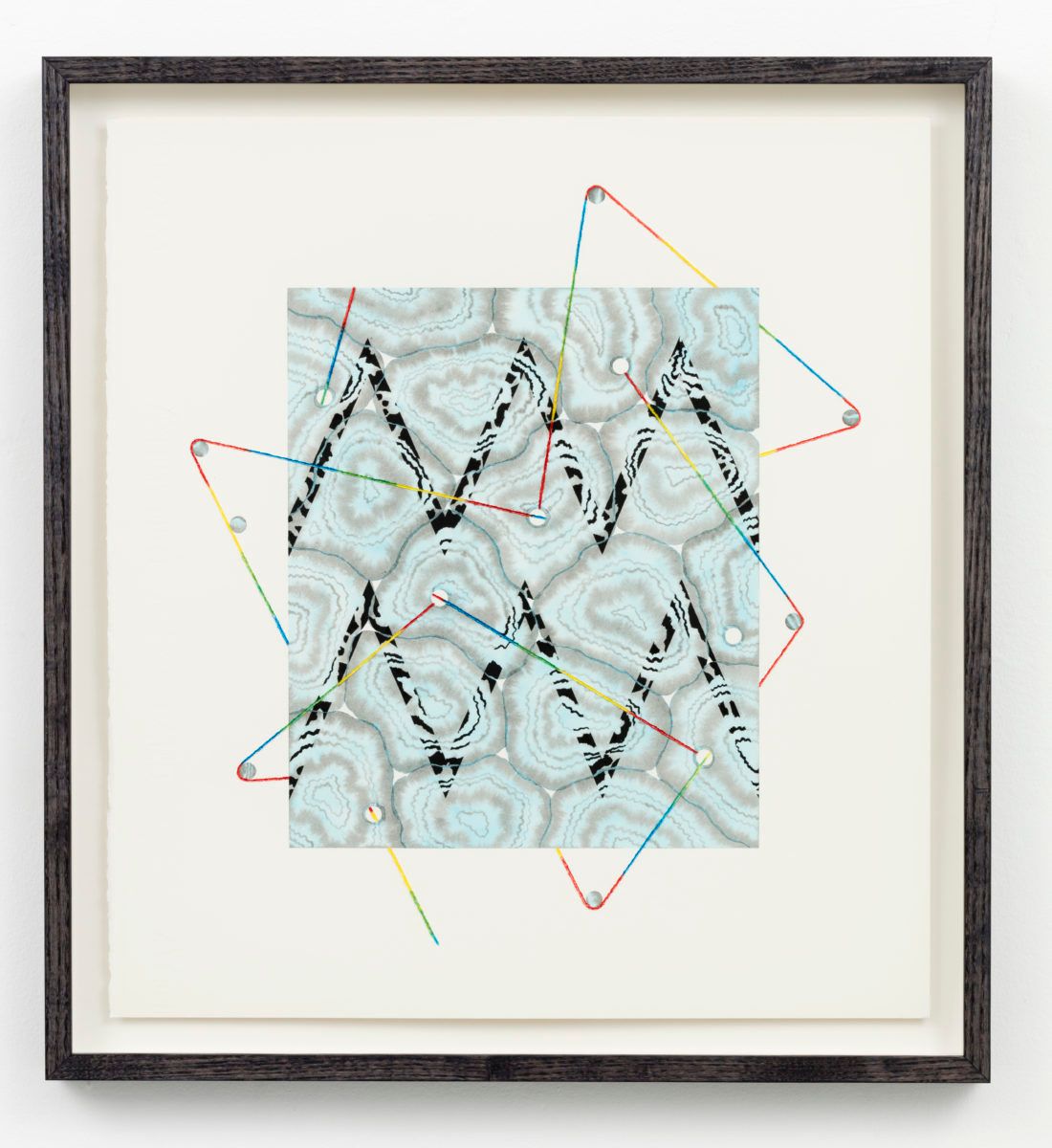
To look at these works from Hill’s 2016 series Forecast (Detail) is to run the risk of the detail, to be seduced by its lures. The title of the series is borrowed from the science of meteorology developed in the 18th century, when weather patterns were first plotted and deciphered. While atmosphere and other quantities might still be studied to apprehend the future, Nature as a whole is not easily knowable. Smooth rectangles awash with watercolour tints are snagged by a tangle of lines, which unleash the spectre of unpredictability in Hill’s work.
In cutting into her exquisite Japanese raindrop washi paper with a blade, Hill recalls the work of an animator in Tokyo who cut straight slanting lines into the cellulose to portray a moving image of rain in film. Hill flays her cuts, allowing the fibre of the cotton paper to fan out and blot, randomly accepting the watercolour paint as it bleeds down the clean line of incision. She invites participation in a visible realm, which is not limited to the gaze but engages our entire affectivity. In engaging with the physicality of the paper, she cedes control to her materials and enjoys the sensation of cutting into her own painting.
For theorist Julia Kristeva, the cut indicates an artwork’s relation to a founding emptiness, providing a link between the spectator and their invisible centre, the unconscious. Hill has always been a fan of the hole, leaving little dots strewn like confetti across her surfaces. In Forecast (Detail), the round holes shift to the outside, acting like pulleys, tugging on the lines that travel the surface to create tension. Her simple geometries and lines are a reference back to the abstract mark-making of the earliest artists of the Palaeolithic period uncovered in 1994 in the caves in Chauvet-Pont-d’Arc, Southern France. There, simple patterns were overlooked in the excitement to celebrate the recognisable animal forms: ‘What is generally ignored by the art critics who manage to enter the cave system are the semi circles, lines and zigzag signs marked on the same walls,’ observed a recent writer in the New Scientist.
Similarly, most scholars have assumed all cave artists were male, but a recent study of hand prints established that the mark making had been done by females. Science seems to be telling us that the first artists were women, and that they invented abstraction. Hill dances around issues of masculinity and femininity in her work, setting up rules and restrictions only to disrupt them. In some works, she deploys her characteristic camouflage patterns of protective colouration, combining them with repeating classical meanders and zigzags. Her colour palette is limited to the primaries: red, yellow, blue. While the daffodil yellow is roughed up by being peeled back in controlled, triangular sections, the red and blue are played off in a less structured fashion.
Hill introduces different saturations to show how these pigments change colour with concentration. Pure reds soften as they are watered down and an ultramarine blue drifts off into billowy cyan washes, leaving the viewer adrift in clouds of gender-assigned pink and blue. These colourful works talk to their white surrounds, addressing the space between the painterly and the precise, detailing a way through, from order to chaos, and back again.
Motoko Kikkawa: A preposterous logic
By Tendai John Mutambu
Motoko Kikkawa’s elaborate universe churns with a boundless, rhythmic energy. Blending expressionism with intricate detailing, her work is as reminiscent of the visionary tradition of kanji Japanese calligraphy as it is of Kandinsky or modern animation. The resulting pictorial field, populated by an unruly mix of bodies, fuses figuration with abstraction into a raucously charged maelstrom. But there remains a delicacy to its vigour, a lightness to its strength. Kikkawa’s forms exist somewhere between disorder and conspiratorial self-organisation, as though gathering their forces for action, perhaps a leap outward at the viewer.
At times the forms move up and down, like the creatures in Untitled (18). Are they in a slow vertiginous decline into pools of formless colour or, inversely, are they ascending into a world of structure, described by Kikkawa’s delicate ink line? Whatever the case, they possess a mercurial magic that resists resolution. With that characteristic look of spilt food colouring (more translucent than lurid) so often found in Kikkawa’s drawing, the blue-green and purple washes of Untitled (18) signal a chromatic restraint on the artist’s part, all the more to heighten the drawing’s compositional strengths: its near-symmetry on both vertical and horizontal axes, for one. (Note how the latter creates the appearance of bodies reflected in a pool of water, playfully punning on the fluid in both exhibition title and medium.)
In the inaugural issue of Documents (1929), a surrealist journal edited by Georges Bataille, the French writer-philosopher introduces his concept of formlessness. Writing on l’informe (the formless), he adopts it as a mode of undoing categories, all the while trying not to establish it as a category of its own. And much like Bataille’s concept, Kikkawa’s drawings harbour something of a self-negating tension.[1] Take, for example, Untitled (6) and its interminable loop from dissolution to condensation (and back again). The work is at once multiple and singular, intricately Apollonian and spontaneously Dionysian. As riotously carnivalesque in colour as it is in form, Untitled (6) is a writhing menagerie of indeterminate creatures.[2] This animistic impulse further extends to Untitled (5), an agglomeration of organic detritus, with spindly root-like tendrils dangling from its creaturely profile.
Of Kikkawa’s recent watercolours, Untitled (14) is, perhaps, the most conspicuously indebted to calligraphy. An orb-like object sits atop a curved base, flanked by a pair of curious-looking totemic forms – part-animal, part-grapheme. Above it a flurry of characters floats around. All seems balanced, in mass and in motion, giving the work a slackened symmetry, like some extra-terrestrial coat-of-arms, possessed, yet still held together by its own gravitational force. Meanwhile, Untitled (7) and Untitled (15) plunk the most contrasting notes: one, a series of cosmic explosions; the other, a petri dish of colour, line, and shape – circular and contained.
Drawing analogies between visual art and its sonic counterpart often feels like treading a well-worn path. But one can dare to risk triteness in a case such as this, where the affinity feels so remarkably potent. Online are several videos of the virtuoso violinist, Motoko Kikkawa, improvising and playing spontaneously – often with fellow noise musicians. Her method of drawing calls upon a similarly intuitive mastery, letting instinct guide her, freely, as she lays down touches of watercolour before following through with a fine-tipped black ink pen. ‘Sometimes I see animal faces, or scenes, like [in] a movie,’ she tells me. ‘But while I’m drawing it often changes into another thing.’ Such is the protean nature of both the work’s creation and its reception: no two minds capture the same thing in those networks of conjoined limb-like forms, fuzzy and feathered, brought together by a deliriously preposterous kind of logic.
[1] So, too, does the title of the exhibition, Fluid Structures. If fluidity is a mode of dissolution, one marked by a yielding to external forces, structure – as its opposite – points us toward something more concrete, more obdurate in its configuration.
[2] In conversation, Kikkawa often refers to her forms as ‘animals’.
Denys Watkins: Accurate misquotations
By Francis McWhannell
There’s only one book in the world, and that’s the one
everyone accurately misquotes.
– Allen Curnow, ‘An Incorrigible Music’
An admission: these are not the works by Denys Watkins that I was expecting to include in Fluid Structures. For a couple of years now, I have admired Watkins’ largely abstract paintings, works populated by organic shapes that evoke alien structures viewable only with the most powerful of microscopes: bacterial rods, flagellal threads, nucleic and mitochondrial disks. Watkins has made watercolours in this vein, and these are the sorts of works I had in mind when I asked him to participate in the show. But eschewing such biomorphic images in favour of the more regularly geometric ones displayed here felt like an appropriate decision, since one of the great pleasures of getting to know Watkins’ work is constantly being surprised, constantly having one’s expectations exceeded.
Restlessly experimental, Watkins’ work spans a wide range of media, encompassing drawings, prints, and kinetic sculpture, in addition to a variety of paint-based techniques. In his image-making, he has flirted with diverse styles and modes, sampling and blending surrealism, pop, and text-based art – seldom solely figurative, seldom completely abandoning real-world references. The references for the works in this show are of course book covers, which appear in the works themselves as digital prints. A watercolour by Watkins sits alongside each cover, mirroring its overall format. Sometimes the correspondence is close, as in Wisdom. Sometimes it is looser, as in Eric. Purged of any text, the watercolours bear a family resemblance to the covers, but they are never their twins.
Watkins’ use of book covers is a reflection of his long interest in, and respect for, design practices, including typography and book design.[1] One could also interpret it as a subtle statement that print and material cultures ought not to be considered in isolation from the so-called fine arts, since these disciplines are all intimately bound up with the historical moment, and with that moment’s aesthetic and ideological concerns. Wisdom in particular would seem to support this understanding, incorporating as it does a strident pattern that might equally be found on a poster, a ceramic jug, or a piece of fabric. The work reminds us that ‘interdisciplinarity’ is far from new, calling to mind the furious exchange between modernist designers and artists, whether those associated with the Bauhaus, Bloomsbury, or – here in New Zealand – the Group in Christchurch.
The books chosen by Watkins are surely also significant in terms of their contents, but quite how we are to read them is not immediately clear. At first glance, they seem anachronistic. This is especially true of the publications that form the basis of Eric and Loan Collection: a 1946 book on the comparatively little-known English artist Eric Ravilious, and a catalogue for an exhibition of ‘British Masters’ that visited Auckland in 1937. Both came from the Fine Arts Library at the University of Auckland, a fact hinted at by the reinforced spine and the printed label. Such books are not esteemed today. We dismiss them for their unglamorous subjects, the limited number and quality of their reproductions, the perceived datedness of their texts. As such, it’s tempting to think of the books in Watkins’ works as inevitable casualties of the march of time, destined to be shifted to offsite stacks or deaccessioned altogether.
But although Watkins is unquestionably a witty artist, and his humour often dark, I find myself thinking of his diptychs as expressive of a genuine affinity for the subject matter of the books. There has lately been something of a revival of interest in Ravilious, who worked across a variety of disciplines, including painting, engraving, and design. One can picture Watkins poring over the publication with interest, extracting elements of value with which to enrich his own multifarious practice. Then, too, one can imagine him leafing through the British Masters catalogue with interest, considering the specific works from the National and Tate Galleries that Aucklanders had access to that spring 80 years ago. What artists and works in our local history might bear the influence of those visitors from abroad?
It may seem trite to say it, but books, like other works of art, are a means to discovery. For people based in Aotearoa in the years before cheap flights and the internet, they were perhaps the primary way of finding out what was going on beyond these islands. Watkins has spent a large amount of time looking at books, not least because he has taught for many years at the University of Auckland, and – as anyone who has worked for a tertiary institution will confirm – one of the greatest perks of the job is the library card. We are fortunate that these works not only reflect Watkins’ incorrigible curiosity, but also provide us with rich material for discoveries of our own. Consider Loan Collection, with its spectral circles of deep green and black, looming against a mottled brown that so perfectly evokes the ageing of once dove grey board. It’s the work of a master, whose misquotations are, in their own way, absolutely right.
[1] It worth noting that Watkins’ undergraduate studies were in graphic design (he subsequently studied fine art) and that a strong design sensibility runs through all his work.
Kristy Gorman
By Victoria Wynne-Jones
a field.
a field as the white of the paper. then, preparation
a surface made wet with water.
a series of inks, each in various stages of dilution.
quietude. pause. decision-making, premeditation, envisaging …
an approach is made.
suspension, slowness … then working quickly, sweeping gestures, moving like a metronome,
keeping to a certain rhythm – back and forth.
interventions upon a surface.
bleed. seeping and soaking. next, evaporation – the time it takes to dry.
the trace of each move builds up and coheres into forms, shapes.
extreme gradients that are impressively even.
each unit, its own materiality.
filling space but also holding back, declining to.
spatial arrangements, with balance and imbalance,
weight, the surrender to or defiance of various physical forces.
a join, a subtle seam, almost imperceptible. a place where one field meets another.
the tension between control and release. instability as inevitable.
a former watery surface
not a plan to be executed but something more unpredictable, a wresting of forms.
painting as elusive, perhaps even unattainable.
Mount Albert, March 2017